2019
SBA Ascent
THE PROBLEM
The Small Business Administration (SBA) has found an increased number of women business owners who have struggled to grow their small businesses.
SBA is looking to create a free, online learning platform for female entrepreneurs all over the country to gain tips and guidance on how to elevate and grow their businesses.
MY ROLE
UX/UI Designer responsible for conducting moderated and unmoderated user interviews, developing wireframes, and conducting usability testing.
TEAM
Jordan Watts, UX Design Director
Richard Guy, Senior Designer
AWARDS
2021 Gold Hermes Creative Awards, The Pitch Playbook Infographic
2021 Silver Davey Awards, Best User Interface
What are users looking for?
We conducted interviews with entrepreneurs who have been involved with the Small Business Administration (SBA) and/or have a background in entrepreneurship. These participants range from aspiring to seasoned business owners who actively look to SBA and beyond to scale their businesses. I wanted to know– how did they start their businesses? What’s their experience with e-learning platforms? What kind of learners are they? and in what ways can SBA make scaling businesses easier?
Through user interviews, it became evident that there isn’t a “one-size-fits-all” approach to building a business, nor should there be.
Users want to be told/suggested content they need to know.
Users appreciate being able to download external resources.
The average time spent on e-learning platforms: is 1-4 hours per week. Interested in content that is easily digestible and searchable.
Users appreciate having a thorough checklist of topics associated with their skill level and/or business size.
Our vision– A tool to meet unique business needs, rather than a set of obligatory courses.
Personalized Learning
Based on our research and vision, we decided to compile our findings together and categorize the data into four distinct user personas and their optimal use case scenario:
Structured Sally
The learner looking to start from the very first learning objective and follow a linear path.
Bob the Builder
The learner picks random learning objectives and jumps around to tailor his knowledge based on his needs.
Bize-Size Billy
The learner with an extremely limited amount of time looking to get quick answers to a specific question.
Curious Catie
The learner is interested to know what the topics can offer them and if there is any pertinent information that relates to her and her business needs.
Choosing Your Journey
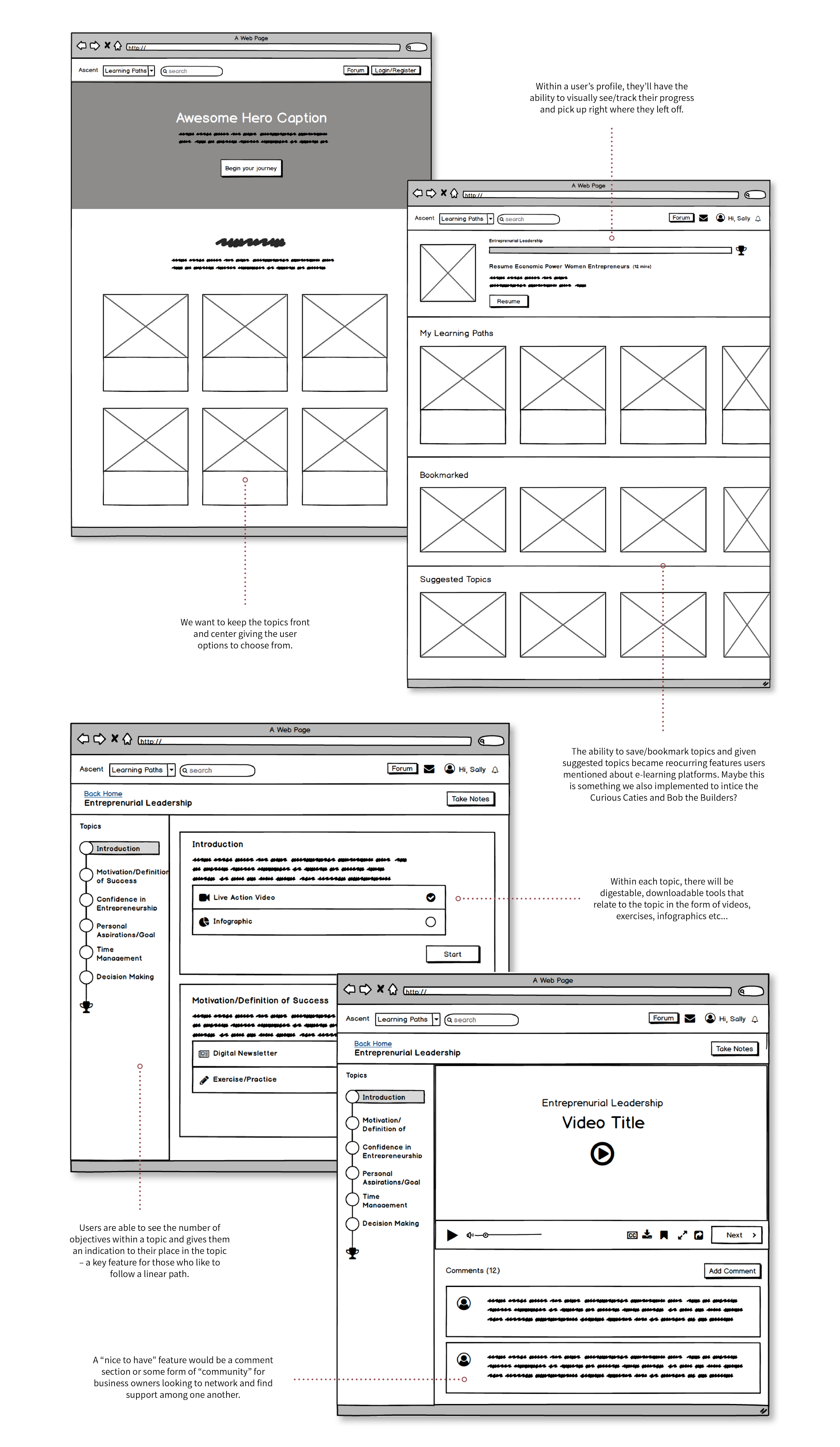
No matter the type of learner you are, we wanted to establish flexibility and free range for the user. Whether that means building their course or following a linear path, it’s ultimately up to them to decide what’s best for their business needs. A few features we knew for sure we wanted to include are:
Provide the user with more than one way to navigate topics.
The ability to save or bookmark topics/progress.
Concise, digestible learning tools that relate to the topic.
A series of “courses” that can be taken linearly OR on a whim.
Accessible and Approachable
Our team worked in tandem with the visual branding team for this project where the e-learning platform name, logo, tone, and color palette were created from the ground up. For a platform dedicated to scaling small businesses, creating a color palette that exudes approachability was essential for us to foster an inviting learning environment.
The commitment to 508 compliance elevates this platform, ensuring that all learners, regardless of visual impairments, can access and benefit from the content. By thoughtfully implementing colors and interactions with adequate contrast and consideration for colorblindness, the UI not only cultivates a welcoming atmosphere but also embraces inclusivity, empowering every learner to thrive in their entrepreneurial journey.
The Ascent of Entrepreneurs
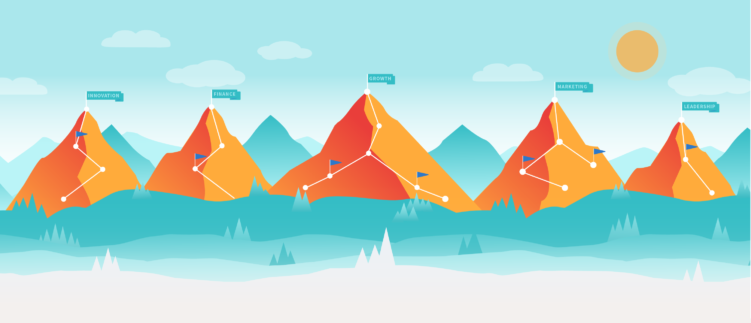
Drawing insights from our user research and stakeholder input, we unveiled our final product, Ascent. As the name suggests, it implies upward movement or a leap from the ordinary to the extraordinary advancement. When it came to an e-learning platform tailored to business topics, the amount of content related to the subject was extensive. It was important to categorize that content into easily distinguishable tiers. “Each topic is called a ”Journey” and the objectives of that topic are called “Excursions”. Each Excursion will incorporate “Paths” that come in various formats that cater to the schedules of our users, ensuring every moment elevates their ascent to success.
Dropdown Navigation – A robust dropdown menu was necessary to add in addition to the amount of topics on the Homepage. We want to enhance engagement by encouraging exploration and discovery– especially for those who aren’t interested in linearly going through the Journeys.
Data-Driven Decisions
During our research, we conducted a series of user interviews to validate our design decisions and identify areas that need improvement. We aimed to gather data that addressed the four types of learners we established at the beginning of our research, as well as reach out to people from the National Federation of the Blind who rely on screen reading devices to navigate through our site. The most informative feedback we received during the interviews was as follows:
About 98% of users had trouble registering for an account.
Users were still confused about a lot of the terms used to describe the tools on the site.
Editable PDF fields and infographics were not easily recognizable and accessible to our visually impaired users.
A more robust search engine is necessary for this platform, as the majority of users prefer to navigate this way.
Before – Users would get frustrated in learning what password requirements were after creating one. There was also no way of knowing which requirements were met.
After – As users create a password, a check mark appears next to the requirement in real time.
Context – A touring modal to assist users in understanding the terms used to describe the tools on the site. This appears after registering for an account and can be accessed at any time throughout the site.
PDF Accessibility – Because screen-reading devices were not picking up sections in PDFs, accessibility tags needed to be added to ALL 68 PDF exercises in the platform.
Before – Search options were vague and specific names needed to be entered in order to get sufficient results.
After – Search options include the type of tool it is along with visual cues to further distinguish what is a path/excursion/journey.
What I’ve Learned
Ascent debuted Phase 1 to the public with a wealth of positive feedback from users and stakeholders. Although our team's involvement was limited to Phase 1 of this project, we've observed positive developments and feedback in the following areas:
Increase in account registrations
Decrease in Help Desk tickets concerning SBA and the Ascent platform
Increase in entrepreneurs applying for small-business-based funding
Changes in priorities and teams have postponed the Phase 2 launch, which emphasizes refining the UI and gathering statistical data to further enhance the user experience. Nonetheless, I gained plenty of valuable insights from this project concerning product and business processes.
How to balance stakeholder and user requirements
I constantly felt a push and pull between meeting the strategic objectives and financial goals of SBA stakeholders with keeping the interest of users who rely on the platform for business advice. Ultimately, this led to some serious creative problem-solving and fostering the one thing that will keep both parties satisfied– trust.
It truly takes a village
Collaboration was key and no product is successful without clear and effective communication between teams. This was my first time working in an Agile environment cross-collaborating between the Project Managers, Learning Experience Designers, Visual Designers, UX Designers, Developers, DevOps Engineers, Directors, and Quality Assurance. With a large team, it became crucial everyone was constantly on the same page and comfortable with having uncomfortable conversations.
Accessibility should never be overlooked
I learned so many valuable insights into implementing proper 508-compliant methods. Emphasizing accessibility not only ensures inclusivity and usability for all users but also improves usability across the board. Clearer navigation, simpler layouts, and adaptable interfaces benefit all users, not just those with disabilities.
Prioritizing the MVP
There were a few compelling use cases that came up involving rich features. However, many of these were either too costly or impractical. I needed to prioritize where the real value was, especially for the initial phase of Ascent, and consider what could be addressed in subsequent phases.